
First of all - why do publishers feel the need to change covers between U.K. and U.S. editions of a book? And even more confusingly, for the book I recently read, they also changed the title!
Here's what I'm talking about:
Here's what I'm talking about:
 |  |
Surely those are two completely different books, right? Nope!
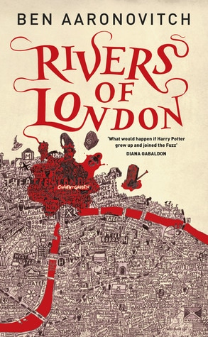
The cover (and title) on the left is the U.K. version. The cover is whimsical (well, maybe not the blood so much), and the old-timey map is wonderful. (I'm a sucker for maps both inside and outside a book.)
The cover on the right is the U.S. version, which means that it's the version that my library had, of course. The premise of the book is that a London police officer discovers that magic is real and is "drafted" into the branch of the police force that deals with ghosts, vampires, werewolves, etc. Not normally my kind of book, but I had heard it described as "grown-up Harry Potter" and wonderfully British, so I thought I would give it a try.
I enjoyed it, but I couldn't read it at night before I went to bed. In fact, I ended up piling other books on top of it on my nightstand because of the cover. The (spoiler!) revengeful ghost aspect of the story was really freaking me out, and I think I can partially trace that to the cover. The U.S. cover just looks scarier than the U.K. cover. To a certain extent, it affected my reading (and enjoyment) of the book.
Has this ever happened to anyone else? Has a cover changed the way you viewed a book, either positively or negatively?


 RSS Feed